Graphic Design

 Print Design

Trento Menu

Illustrator


Sainclair Memorial Banners

Illustrator, Photoshop

Vertical 4x2
Horizontal 6x3


Growth Poster
InDesign

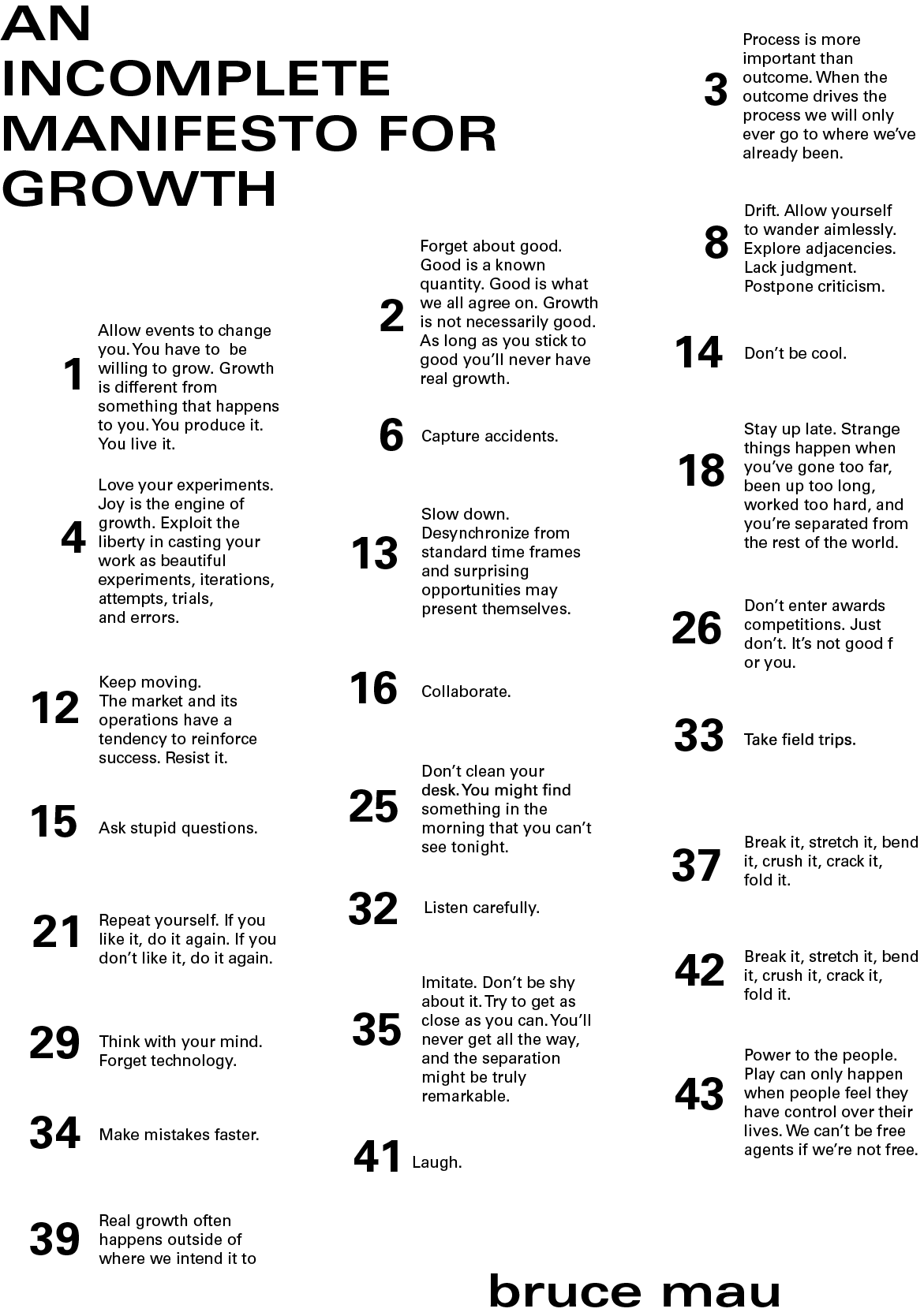
Poster designed to incorporate 25 of the elements from Bruce Mau’s Incomplete Manifesto for Growth. This was all about working with a grid and trying to create hierarchy among a lot of text.

Even though blocks of text have been offset there is still a sense of unity created through using a single typeface
and keeping the information combined to a grid. 

Hierarchy was created through color and different weights of the typeface as well as through the size of the text.


Neon Sign Stickers

Illustrator

A collection of stickers inspired by neon signs.

This project consists of 15 stickers and the front and back of a display insert.

Assortment of 15 neon sign stickers.

Front of display insert.

Back of display insert.


Glitter Ducklings

Illustrator

This project consists of a blister display for glitter rubber ducks.

Background of blister display. The design is to be printed on glitter paper.

Assembly instructions to show how the product fits in with the design.


In Bloom

PHOTOSHOP


 Branding

Seaglass resort & Spa
Photoshop, Illustrator

Branding for a beach resort described as “a luxury beach resort designed for those wanting to ‘get away’ and indulge.” Some of the adjectives used to describe the brand: costal, soft, minimal, high-end, luxury


hera subscription box
Photoshop, Illustrator

Branding for a subscription box named after the Greek goddess Hera. She is the goddess of women and marriage. She is the queen of the gods.


Outside the Lines
InDesign, Illustrator

Outside the Lines was a branding project for a HOW Design conference. Creating the identity for this series stemmed from the designer, photographer, and illustrator that were chosen to speak at this event. 

The color scheme, design elements, as well as the name for the conference all came from different elements of the speakers’ work. 

Keeping a mostly black and gray palette came from Hoop’s black and white photography. The pop of pink is a color that Walsh uses a lot in her work. And the graphic, textural lines were inspired by the way that Laine illustrates hair.


Junk Food Pattern Plush

Illustrator

This project consisted of designing a repeating patterns of junk food in illustrator, designing plush with sections of the patterns, a hangtag and a poster.

The plush was designed with a singular body, similar head shape and the same pattern to make them cohesive.

Concept designs for plush

Plush

Repeating junk food pattern.

Poster for the plush

Plush hangtag


Janic’e Nicole Fashion Identity

Illustrator, Photoshop

Janic’e Nicole is a fashion designer inspired by African prints, women of color, the meaning of the butterfly, and trees. 

Janic’e wanted all of this to be reflected in her identity. Drawing inspiration from iconic fashion brands a monogram type of logo was designed. Two leaf shapes were then added on to look like a butterfly resting on the down-stroke of the N, combining two of the elements that really inspire her work. 

The bright color pallet was chosen because it captured a carefree spirit that Janic’e felt was very important in her design.    

Screen Shot 2019-04-22 at 2.13.25 PM.png

Black Kettle

Illustrator, vinyl


Gimmie Some of Ur Love

Illustrator

The aim for this poster was to create something that was different from what typical pop-punk tour posters look like. And then use the poster as inspiration for merchandise that can be bought
at the concert. 

A bright, tropical aesthetic, and a handwritten typeface were used to create a playful look for these designs. This playfulness is something that is not typically seen among pop-punk and alternative tour posters so this was something that was done to help this tour stand out among the rest.    

 Inhale, Exhale

Mixed media, Premier Pro

We all have to face disruptions in our lives; whether it be something that only effects one day or something that alters many. My anxiety is something that disrupts my life on a daily basis.

Everyone has a different way of coping with major events that happen in their lives. My focus is on mental illness; specifically how I cope when my anxiety becomes too much to bear. The repetitive and precise nature of folding origami allows me to focus on the meditative action rather than the anxious thoughts that I have. The origami that I have folded is a visual representation of my anxiety. By doing this, it’s my goal to transform what may often be seen as a negative and display it in a positive light.


 Apparel Design

Apparel Design Projects


Atletico Apparel

 Social Media

Social Media & E-mail Posts

 Web & App Design

Weatherful

Illustrator

A weather app designed to be streamlined and easy to use. The appearance was designed to be something unique; something that sets it apart from all the other weather apps available.


Bloom Cafe

HTML, CSS

This cafe website was designed with a simple theme in mind to put emphasis on the whole farm to table concept. 

A simple layout combined with a cohesive, simple color scheme help to really keep the focus on the overall concept of the cafe.

Neutral browns were combined with shades of purple to help convey a welcoming and warm feel for the website.


Spark Website Design

Illustrator

Website concept for a jewelry and accessory brand called “Spark.” The concept is based on a new collection called “Golden Hour.”

The concept uses current design trends as well as colors that represent the warm tones often associated with the golden hour.


Bias Blog Page

HTML


Baltimore Alliance for Careers in Healthcare Responsive Website

HTML, CSS

The redesign of Baltimore Alliance for Careers in Healthcare’s website was all about updating it was responsive, easier to navigate, and easier to find the information that the user desired. 

The main concern for this website was taking all of the preexisting copy content, reviewing it, and then editing it and breaking it up into different categories. After organizing the information, a new color scheme was decided upon as well as type choices and photos. All of this came together to create a clean, simple, and easy to navigate responsive website. 


 Packaging Design

boxes for different redemption products


Squashies Boxes

 PDFs

Please click on a cover to open the pdf in a new tab.